I have already discussed my text project, however I believe I need to properly discuss and evaluate my work.
For one part of this project we were given a random word from a bag, mine was evolution, and had to express the meaning of the word and how we are able to express this word typographically. Since at this point there were a number of workshops going on, I chose this project to take to the workshops with me and work from this brief.
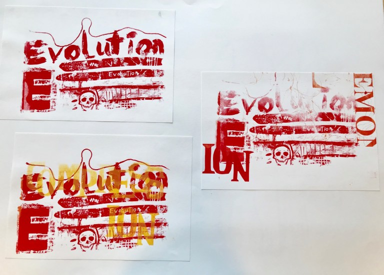
In the silkscreen printing workshop I took a more experimental approach, where I focused more on manipulating the medium. To begin with, when faced by the medium and the tools a basquiat-esque idea popped into my mind since I was considering the word evolution, since his un-put-together work has been a significant part of the evolution of art. To create the stencil that I did I used string, paintbrushes, my own nails, scratching tools and a toothbrush, I became more interested in the huge variety of mark making that changes the way the light filters through and playing with this rather than on my actual word. I did consider the meaning of the words to me, since evolution is a constant cycle however it changes and is not a linear concept in my opinion, I then thought of the best way to portray this idea. The line with the string represents this steadfast idea however is not straight and waves and wobbles, this came across as a dark line across my prints which I found quite effective. I would be nice to use this technique again in the future however for line drawings and then being able to print in this on a variety of surfaces. The other line I made to represent evolution was a thick straight line, however I scratched into it and removed sections which again demonstrates the non linear nature of evolution and how it changes and is manipulated throughout time. Such as the affects that climate change could potentially have on human evolution. Whilst I was printing I chose the colour Red initially and then went on to experiment with another colour and layering other people’s on-top of my own. I think I did get too hooked up in the experimental side of the work and lost sight of the actual brief, however I am very pleased with the work that I produced due to the way I willingly explored the medium however I am unhappy with the composition of the prints since it is too busy and in my opinion the pieces do not work. I would like to learn further how to used this medium and how to layer properly and create complex prints which are pristine and calculated. This could certainly play a part in my growing interest in illustration and graphics.


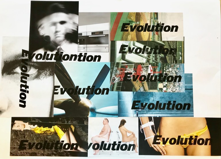
The wordpress workshop then allowed me to re-evaluate my ideas and think more about the meaning of my word. The most interesting thing for me when doing this workshop was how you are able to create type that is consistent since I have always worked with hand drawn type. You’d think it would lose the sense of the human and handcrafted feel of the type, however, each letter has wear and tear from use and each letter still has character. I chose a bold itallic font for these reasons; I liked the way that it was a strong consistent bold type so it mirrored the concept of evolution and the itallic gave it a feel as if it is going on. I then chose to go through magazines and tear pages out to print my word on. I chose magazines since they are a physical example of human evolution, riddled with technology, makeup, fashion and furniture adverts which are all examples of modern day society and what industries are currently bringing in as new parts to the evolution and development of society and our tastes. Therefore printing this word in this font on these pages seems very applicable in my own opinion. If I had gone further I would have liked to illustrate a couple of these pictures I found in magazines or do my own illustrations and print the word on those and expand my project and try new types. For me when I see a type it conjures a feeling and an ambience in my mind, thus it is interesting how a type is able to influence my headspace and ideas. This has brought me to the conclusions that I would have liked to also experiment with other types and see how they come together in the same backdrop to produce a whole alternative feel to a print.